

CASE STUDY: MedVista | Burlingame, CA
Giving a Voice to a Story Already Written.
Branding / Art Direction / Graphic Design / Custom Embroidery
Some creative projects begin with a brief. Others begin with a relationship.
Medvista is a family-operated hospice agency proudly serving the Bay Area; providing compassionate, dignified, and personalized end-of-life care tailored to each patient’s needs — medically, emotionally, and spiritually.
My connection to MedVista Healthcare began through my wife, Dulce, a medical social worker who has spent years working in hospice care. Through her, I’ve developed a deeper appreciation for the compassion, dignity, and human connection that define this work.

When Dulce approached me about designing a brochure for MedVista, the opportunity felt like a natural intersection of my professional experience in healthcare, my graphic design background, and my belief that meaningful design begins with understanding people.
MedVista already had an established identity, a recognizable logo, and a clear mission. They weren’t looking for a new story.
They needed someone to help give that story a voice.
THE CHALLENGE
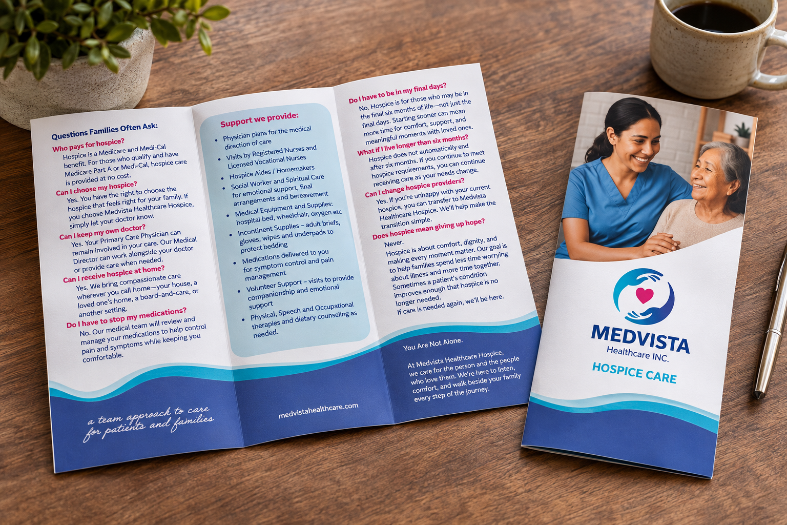
The initial assignment was straightforward: create an informative, approachable brochure that communicated MedVista’s hospice services to patients, families, and caregivers.
But communicating healthcare information requires more than placing words and images on a page.
For families navigating difficult decisions, information needs to feel accessible, organized, and reassuring. The challenge was to take existing messaging and present it in a way that balanced clarity with compassion while remaining consistent with MedVista’s established brand.
The objective wasn’t to reinvent MedVista. It was to strengthen how people experienced the organization.
THE APPROACH — Designing with Intention
Drawing on my graphic design training, I approached the brochure through typography, visual hierarchy, composition, color, and information architecture.
Every design decision served a purpose.
I organized the content into a structured trifold layout, creating a natural reading sequence that made the information easier to navigate. The balance of typography, imagery, white space, and MedVista’s existing color palette helped establish a visual rhythm that felt both professional and welcoming.
The goal was to communicate important information without overwhelming the reader.
Working within MedVista’s established identity also meant understanding when to introduce a new design element and when to let the existing brand speak for itself.
Beyond the Brochure — Extending the Identity
What began as a print design assignment grew into a larger opportunity to bring consistency to MedVista’s branded materials.
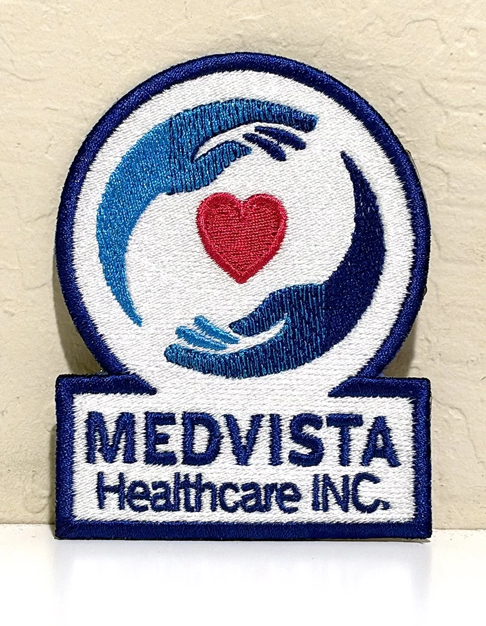
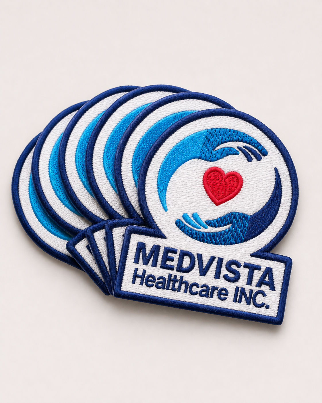
I worked directly with the company’s manager to develop a custom embroidered patch using MedVista’s existing logo as the foundation.
Rather than simply reproducing the logo, I explored different patch shapes, borders, and configurations, considering how the design would translate into a physical embroidered application.
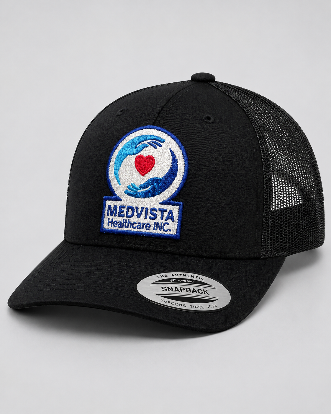
Through multiple iterations and collaborative feedback, we arrived at a patch design that preserved the integrity of MedVista’s identity while creating a distinct, recognizable piece suitable for apparel.
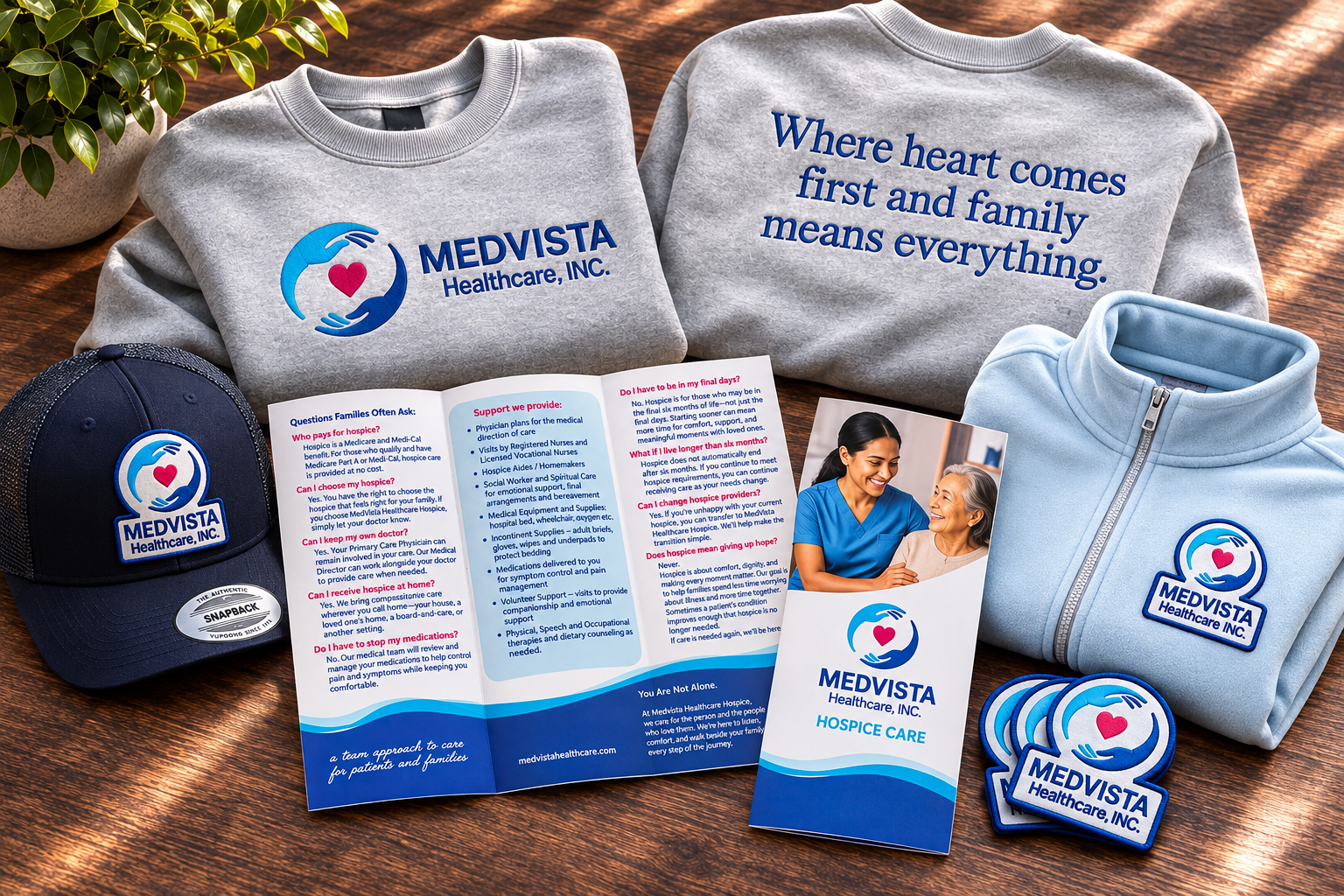
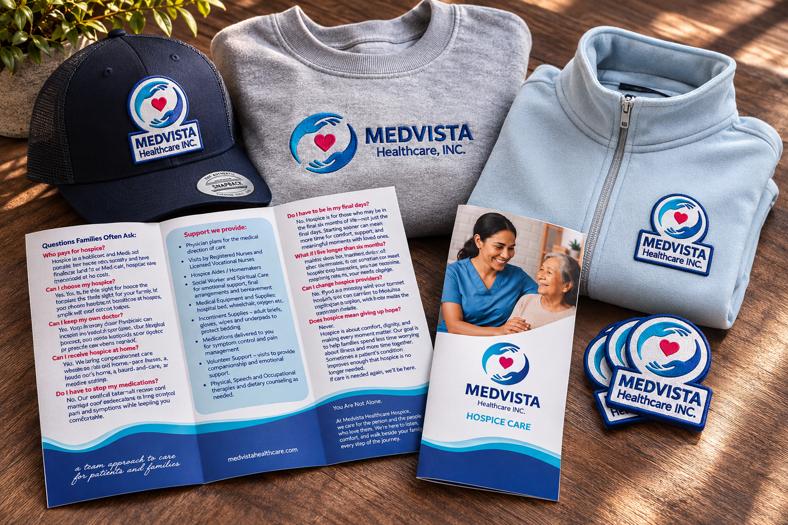
The patch became a unifying element across branded headwear and outerwear, complementing the embroidered crewneck sweatshirts and printed brochure.
Each piece had a different purpose, but all belonged to the same visual family.
CUSTOM BRANDED APPAREL
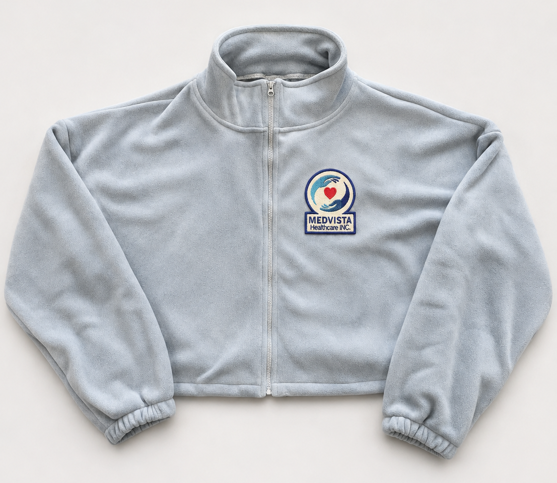
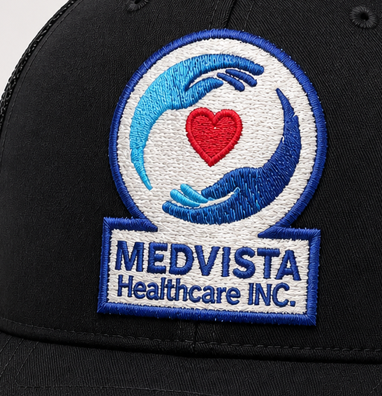
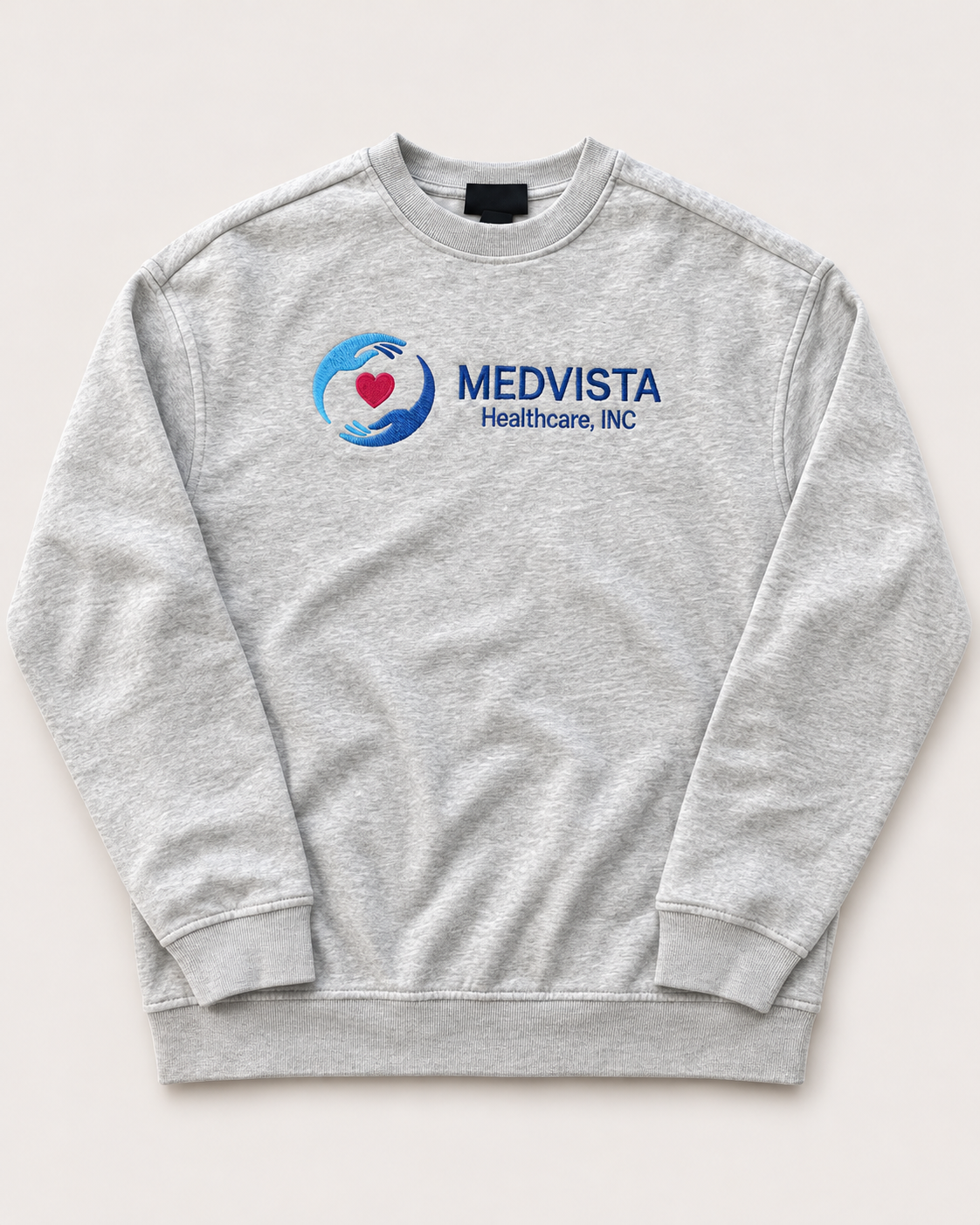
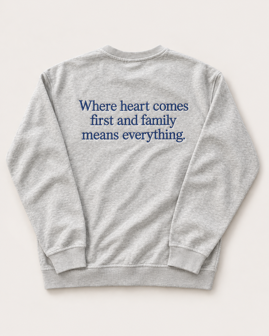
Extending MedVista's identity beyond print, I developed a coordinated collection of custom apparel designed to make the brand both recognizable and wearable. The heather gray crewneck sweatshirts feature MedVista's logo embroidered across the chest, complemented by the company's heartfelt message, “Where heart comes first and family means everything,” embroidered across the back.
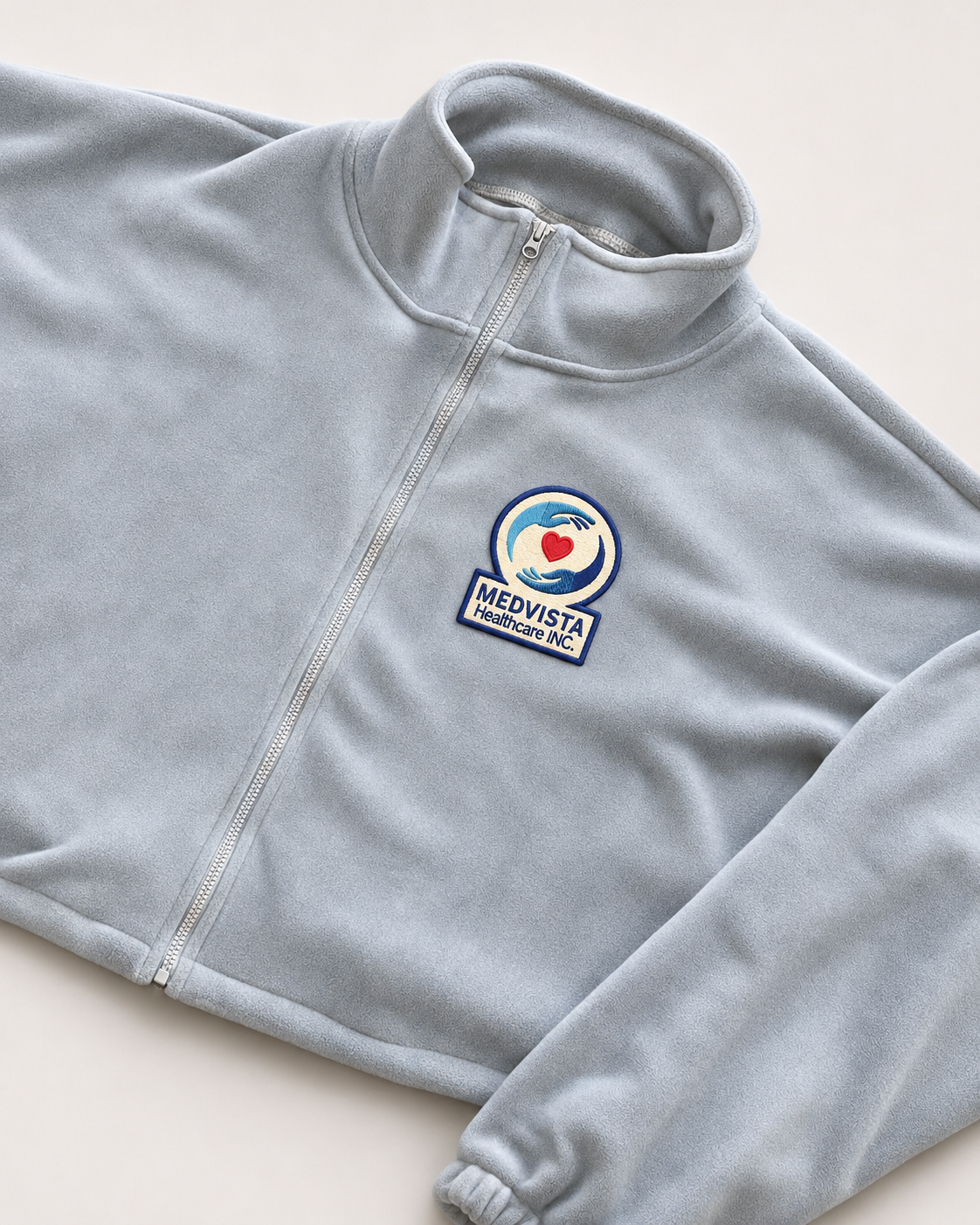
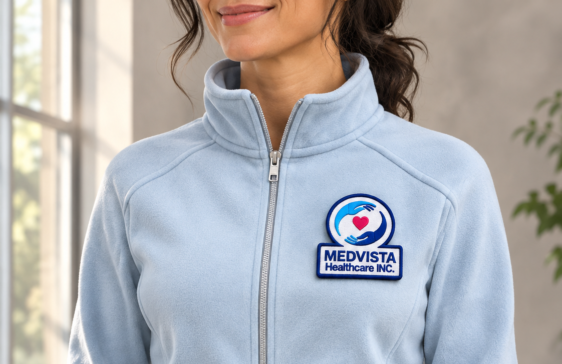
A patched trucker cap showcases the custom-designed patch in a classic, versatile application, while a pale blue women's zip-up jacket offers a softer expression of the brand, drawing from MedVista's existing color palette. Each garment was thoughtfully considered for color, embroidery placement, scale, and overall presentation.
Together, these pieces create a consistent visual identity that extends beyond traditional marketing materials, reinforcing the organization's professionalism, compassion, and sense of connection.
ART DIRECTION — Bringing Everything Together
Beyond designing individual assets, I considered how the entire collection would look and feel as one cohesive brand experience.
From embroidery placement and apparel color selection to patch application, product presentation, and photography, the project became an exercise in art direction.
The objective was to ensure that whether someone encountered MedVista through a brochure, a staff uniform, or a piece of branded merchandise, the experience felt familiar, consistent, and intentional.
Every detail was an opportunity to reinforce the same identity.
THE BIGGER PICTURE
Making Things Mean More.
I've always believed that everyone and everything has a story worth telling. And sometimes, the most meaningful creative work isn't about starting from scratch. It's about recognizing the value of what's already there and finding new ways to bring it to life.
MedVista already had its own identity, purpose, and story — one rooted in compassion, care, and human connection. My role wasn't to redefine it, but to understand it, respect it, and give it a voice that could carry across different mediums.
From graphic design and branding to embroidery, apparel, and art direction, every creative decision was an opportunity to make that story more tangible, more recognizable, and more connected to the people it represents.
Because for me, creativity has never been just about making things look good. It's about the people, the stories, and the connections that give those things meaning.
The story was already written. I simply helped bring it to life.
MAKING THINGS MEAN MORE.
MEDVISTA HEALTHCARE x RAY2WICE CREATES x FRISCO THREADZ