
THE SIGN, THE SHIRT AND THE THREADZ YOU CAN’T SEE
GINO & CARLO | North Beach, San Francisco
Branding / Art Direction / Graphic Design / Custom Embroidery
How one conversation, a few neighborhood connections and a little creative thinking turned a custom work shirt into something bigger
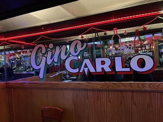
GINO & CARLO × FRISCO THREADZ × RAY2WICE CREATES
THE THREADZ THAT CONNECT US
MORE THAN A NEIGHBORHOOD BAR
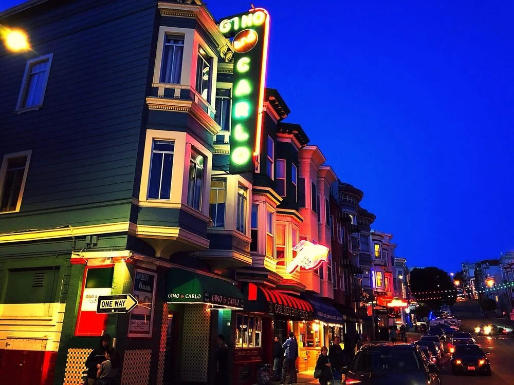
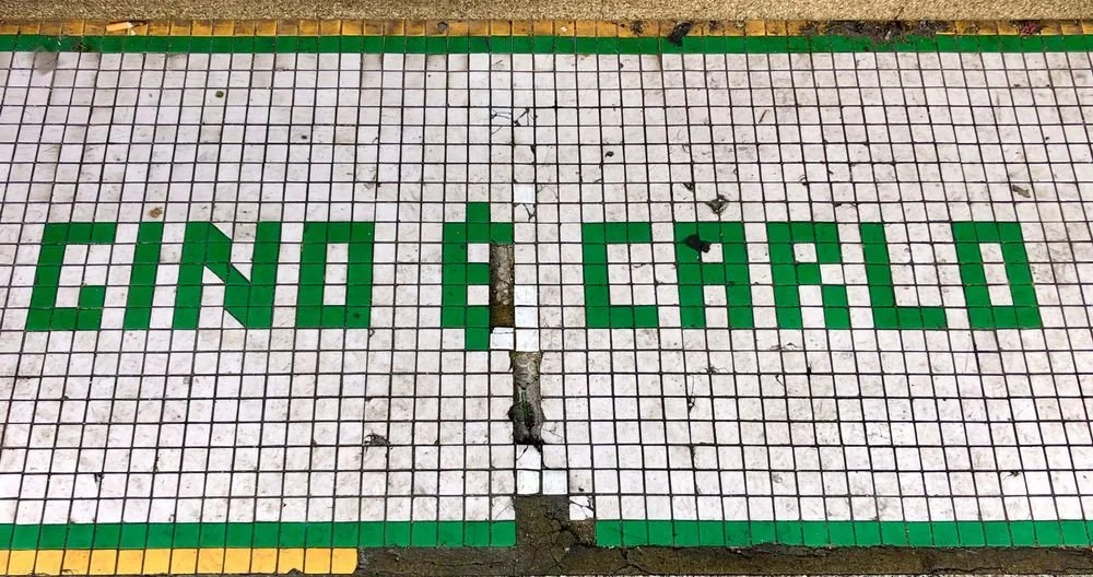
Established in 1942, Gino & Carlo has been part of the fabric of North Beach for generations.
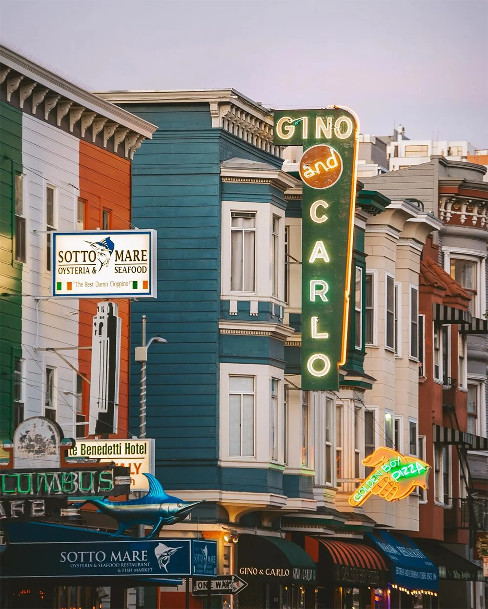
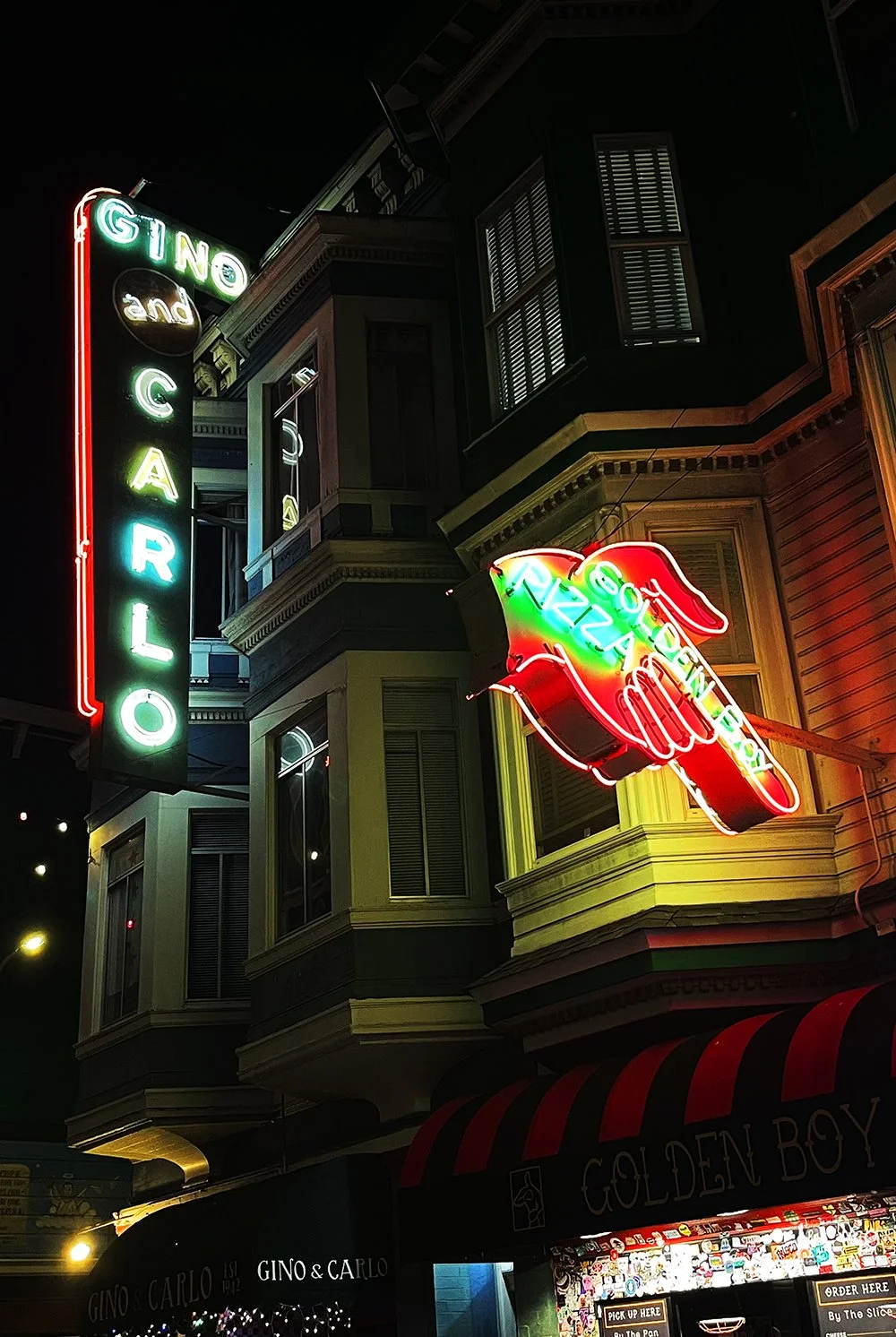
Its familiar storefront, distinctive green facade, and iconic vertical neon sign are all part of what makes the place recognizable. But the real history lives in the people who've spent their lives there.
As Brett and I got to know each other, he shared more about the family and relationships behind the business.
His uncle, Ron Sr., worked at Gino & Carlo from 1976 to 2017, spending many of those years as a partner alongside Frank Rossi Sr. Brett started working there in 2014 and became a partner in 2022.
Today, he runs the bar alongside his cousin Ronnie, who joined in 2017, and longtime partner Frank Rossi, who has been part of the business for roughly 36 years.
That kind of continuity says something about a place.
Generations of ownership, familiar faces, and relationships that stretch beyond the walls of the bar.
And that's what made the opportunity to create something for Gino & Carlo so special.
FROM A SIMPLE REQUEST TO A DESIGN CHALLENGE
The original request was straightforward.
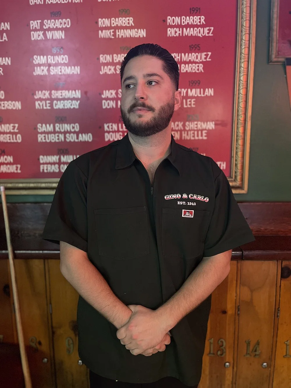
Brett wanted a custom work shirt that incorporated Gino & Carlo's existing logo and branding.
I started by looking at the visual elements that already made the bar recognizable. The colors, the lettering, the circular G&C emblem, and especially the tall, vertical neon sign hanging outside.
Rather than introducing an entirely new design language, I wanted to work with the identity that generations of customers already associated with the bar.
After exploring a few different ideas with Brett, we decided the sign would make the perfect back piece.
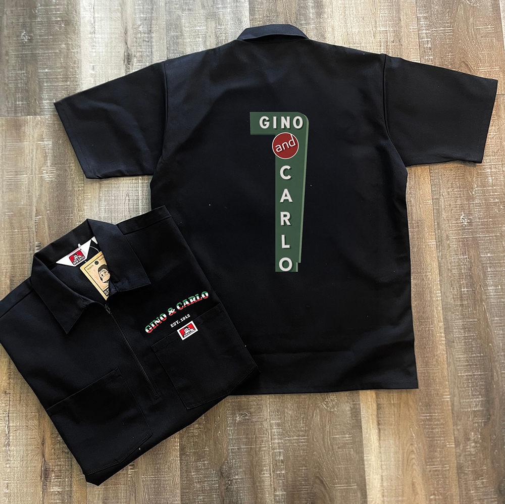
The first concept featured a black work shirt with the bar's branding embroidered on the chest and a recreation of the neon sign across the back.
But as I continued working through the design, I began thinking about the amount of embroidery required to recreate the sign.
The large green background would need to be filled with thousands of stitches. Not only would that increase the production requirements, but it would also add density and weight to the garment.
And because these were shirts intended to be worn by people working behind a busy bar, comfort mattered just as much as appearance.
That's when I came up with a different approach.
LETTING THE FABRIC DO THE WORK
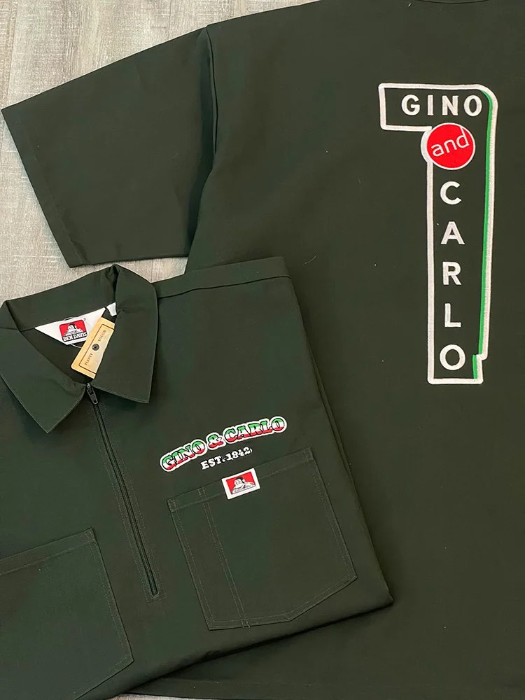
Instead of embroidering a green sign onto a black shirt, what if we started with a green shirt?
The color of the garment itself could become the background of the sign.
That single adjustment changed the entire construction of the design.
By using the fabric as part of the composition, I could eliminate much of the unnecessary fill stitching while preserving the recognizable lettering, shape, and details of the original sign.
It was a cleaner approach that made the design simpler and less costly to produce, more comfortable to wear, and visually more connected to the bar's familiar green identity.
We kept the embroidered Gino & Carlo branding on the chest, along with the established date, and refined the vertical sign on the back.
What I appreciated about this solution was that it didn't require adding anything.
It actually required taking something away.
Sometimes good design isn't about how much you can put into something. It's about knowing what doesn't need to be there.
The result felt less like a logo placed onto a shirt and more like a garment that naturally belonged at Gino & Carlo.
Brett loved it.
And what began as a request for one custom shirt quickly became an order for twelve to outfit the staff.
WHEN THE CUSTOMERS STARTED ASKING
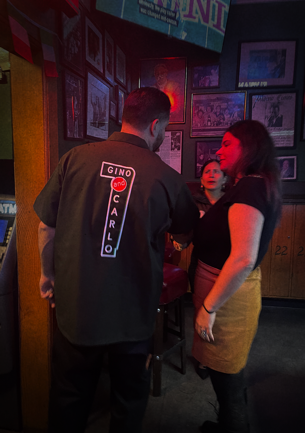
Once the shirts made their way behind the bar, something interesting happened.
Customers started asking where they could buy one.
Brett told me that patrons were interested in purchasing the shirts themselves, and he liked the idea of offering them as merchandise.
There was just one concern.
Custom embroidered work shirts aren't inexpensive to produce, and he worried that the retail price might be too high for customers.
I understood his concern, but I saw another opportunity.
Rather than focusing only on how to make the shirts cheaper and sacrificing quality, I suggested thinking about how we could create more value around them.
What if the shirt became part of something bigger?
What if we created a small collection that celebrated Gino & Carlo's heritage and gave customers a few different ways to take a piece of the bar home?
That's when the conversation shifted from custom uniforms to merchandise and creative direction.
A PINT GLASS, A MATCHBOOK, AND A LITTLE COINCIDENCE
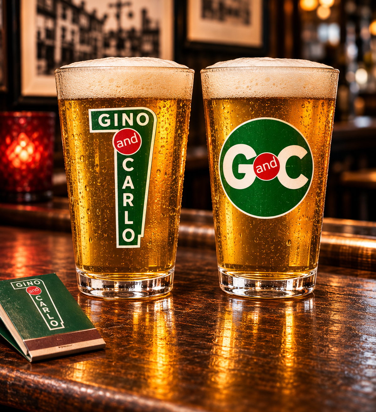
My first suggestion was to pair the shirt with a custom branded pint glass.
Brett laughed and told me they already had glasses made and had been trying to figure out how to sell them.
Then I suggested something else.
Matchbooks.
I've always appreciated the kind of everyday objects that eventually become collectibles.
Vintage advertising, packaging, old restaurant souvenirs, and little pieces of memorabilia
that were never necessarily intended to be preserved.
Matchbooks are a perfect example.
Small, inexpensive objects that once served a practical purpose but also carried the personality of a business.
I remembered a set of beautifully designed matches my now wife had brought home
from Miami after her bachelorette party. Something about the presentation stuck with me.
I loved how such a simple object could feel so thoughtfully designed that you'd actually want to keep it.
When I suggested bringing premium custom matchbooks into the collection, Brett told me something I hadn't expected.
He and his business partners had recently been discussing bringing back matchbooks themselves.
Gino & Carlo used to have them years ago, and they thought reviving that tradition would be a fitting touch.
Of all the things I could have suggested, we'd somehow landed on an idea that was already part of the bar's history.
It felt like we were onto something.
MAKING SOMETHING THAT FEELS LIKE IT'S ALWAYS BEEN THERE
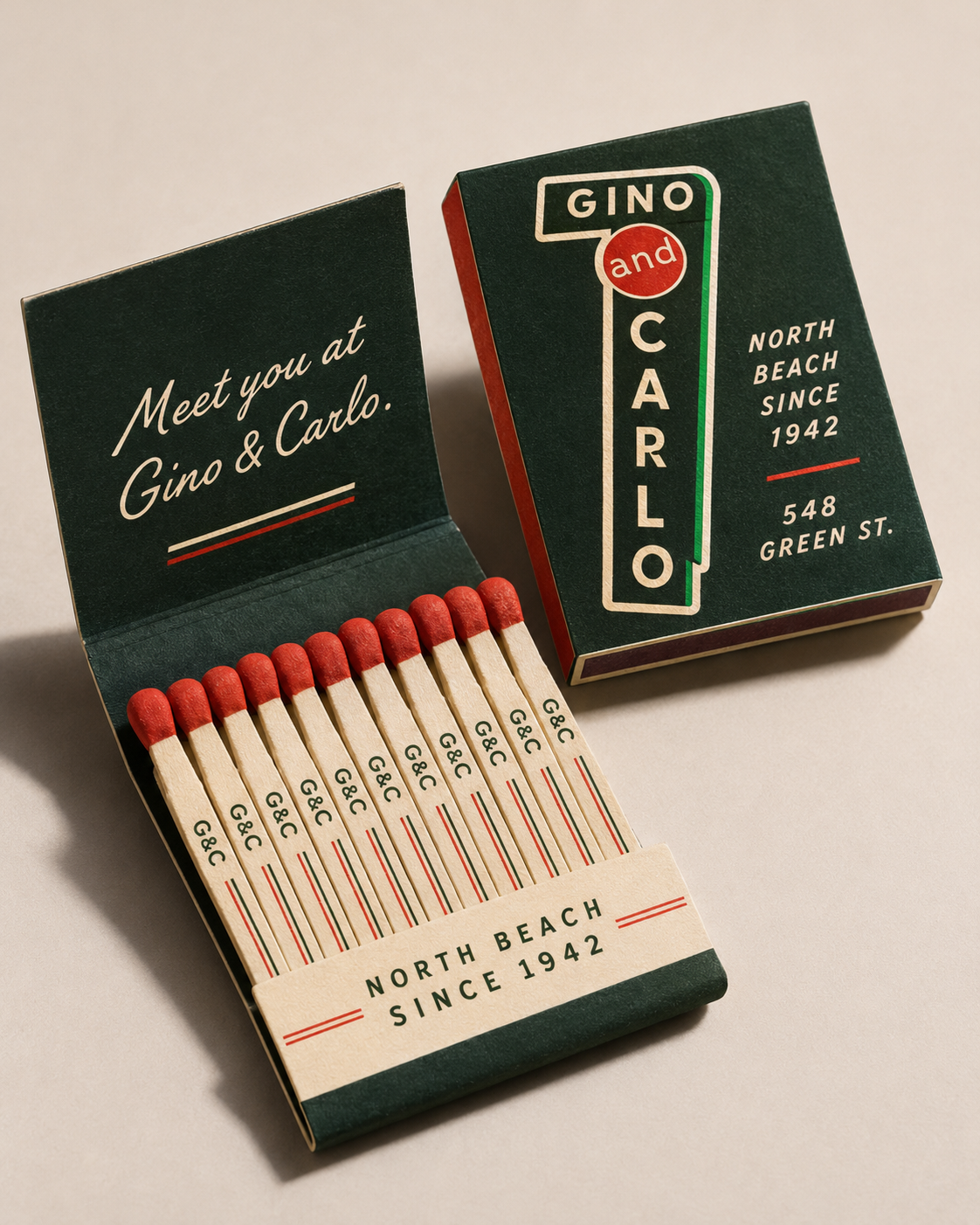
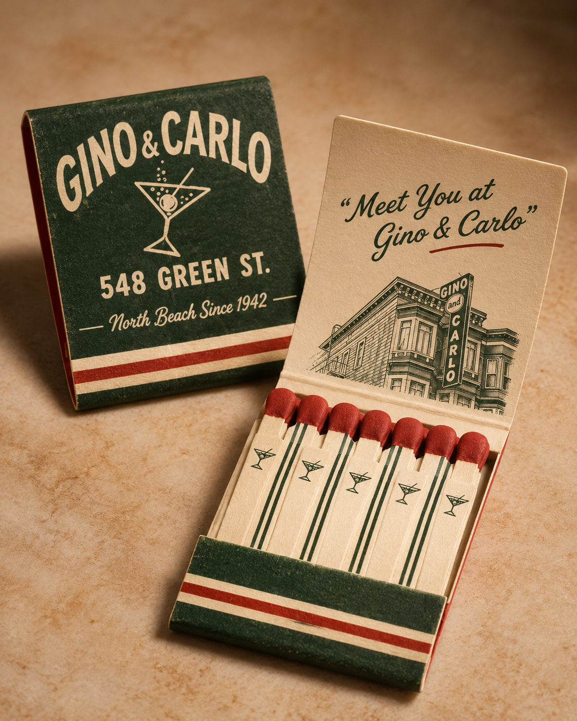
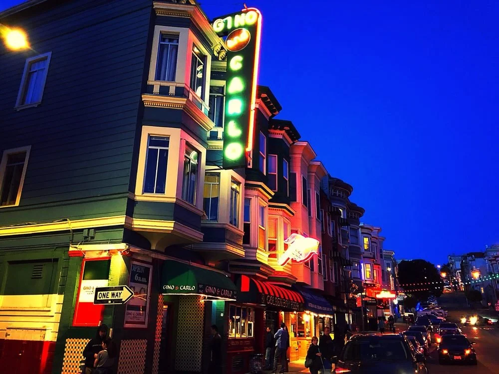
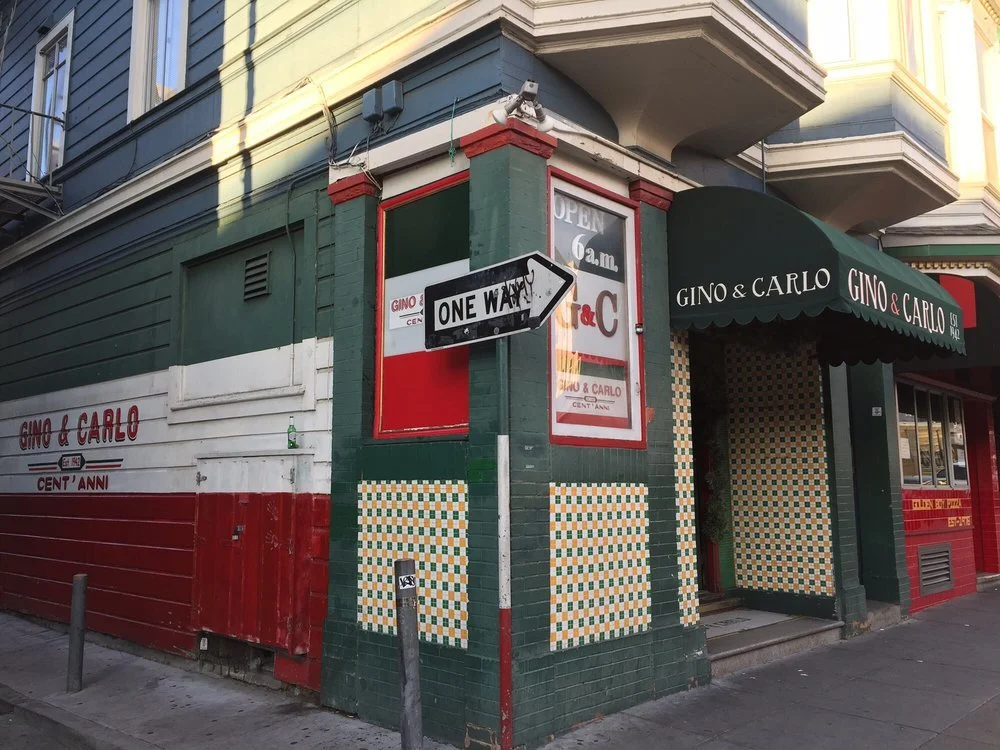
I began developing matchbook concepts inspired by Gino & Carlo's existing visual identity.
The familiar green, red, and white palette. The vertical neon sign. The original branding. The establishment date. Even the bar's billiards culture offered inspiration for additional directions.
Rather than creating a single generic promotional design, I explored different interpretations that could feel like genuine pieces of memorabilia from the bar.
Some concepts leaned into the classic signage. Others explored vintage typography, traditional matchbook layouts, and subtle references to the atmosphere and character of the place.
The goal wasn't to make something that looked artificially old.
I wanted it to feel authentic.
Like something you might discover tucked away in an old drawer, saved from a night out decades earlier.
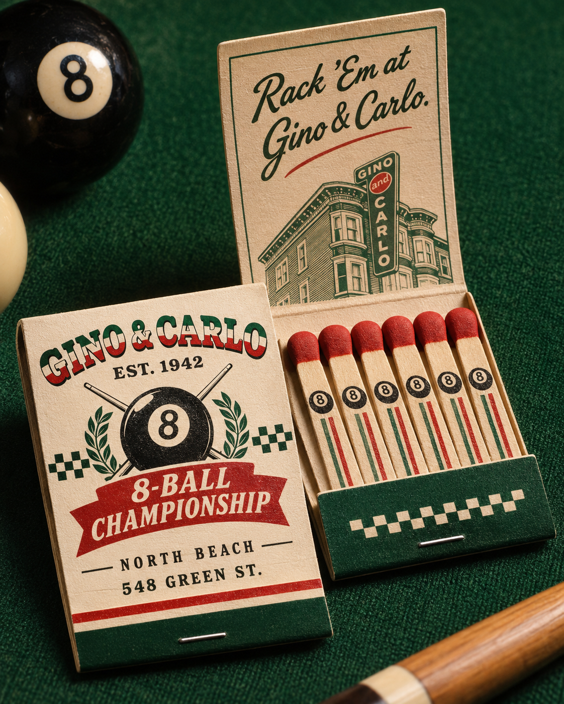
When I shared the concepts with Brett, I explained the thinking behind them.
"The goal is to make them feel timeless."
"Like they've always been there."
His response was simple:
"Amen that's the goal."
That exchange meant a lot to me.
Because it confirmed that we were approaching the project from the same place.
We weren't trying to modernize Gino & Carlo or give it a completely different identity.
We were trying to celebrate what already made it special.
Brett responded enthusiastically to the concepts and mentioned sharing them with others. The conversation had grown far beyond that initial work shirt.
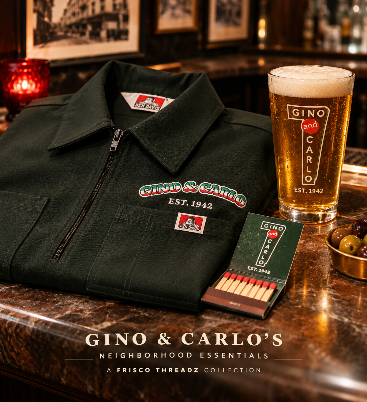
THREE PIECES. ONE SHARED STORY.
As the ideas developed, I shared how I envisioned bringing the different elements together into one cohesive merchandise collection.
The embroidered work shirt represented the people behind the bar. The staff, the familiar uniforms, and the iconic signage that has become part of Gino & Carlo's identity.
The branded pint glass represented the experience of being there. Sharing a drink, a conversation, and a memory inside a place that's been bringing people together for generations.
The custom matchbook represented the nostalgia and history of the establishment. A revival of something the bar once offered, reimagined as a thoughtful keepsake.
Individually, each piece had its own purpose.
Together, I believed they could become a strong, unified branding package that felt consistent with the business and paid genuine respect to its history.
That's how we arrived at the merchandise mock-ups: a collection of complementary objects built around the identity Gino & Carlo had already established.
The embroidered shirts had gone from concept to completed uniforms.
The pint glass and matchbook designs represented the next potential chapter—a creative direction that could extend the bar's story into merchandise customers would be proud to own.
And what made the idea meaningful wasn't simply that the pieces looked good together.
It was that each one connected back to something real.
The people. The place. The history. The experience.
THE BIGGER PICTURE
Making Things Mean More.
I've always believed that everyone and everything has a story worth telling. And sometimes, the most meaningful creative work isn't about creating something new. It's about recognizing the history, character, and connections that already exist and finding thoughtful ways to carry them forward.
Gino & Carlo already had more than eight decades of history, an unmistakable identity, and generations of people who made it more than just another neighborhood bar. My role wasn't to reinvent any of that, but to understand what made it special, respect its heritage, and find new ways to celebrate it.
From a single embroidered work shirt to a coordinated collection of heritage-inspired merchandise concepts, every creative decision was an opportunity to honor the past while imagining how those traditions could continue into the future.
But what makes this collaboration especially meaningful to me is how it all began. A friendship, a good word, and a shared appreciation for the community opened the door to an opportunity I never saw coming. A bar I'd visited before became a place I now have a personal connection to.
It's a reminder that the most meaningful work doesn't happen in isolation. It's built through relationships, mutual respect, and the trust people place in one another.
Because for me, creativity has never been just about making things look good. It's about the people, the stories, and the connections that give those things meaning.
The history was already there. The relationships opened the door.
I simply found a way to bring those stories together.
The Threadz that Connect Us.
MAKING THINGS MEAN MORE.
GINO & CARLO × RAY2WICE CREATES × FRISCO THREADZ